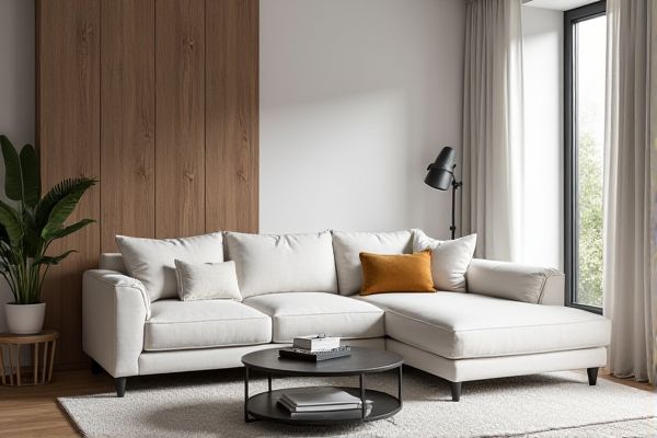
Monochromatic palettes use variations of a single hue, creating a harmonious and soothing visual effect ideal for minimalistic designs. Explore the rest of the article to discover how your color choices can transform the mood and impact of your creative projects.
Table of Comparison
| Feature | Monochromatic Palette | Complementary Palette |
|---|---|---|
| Definition | Uses shades, tints, and tones of a single color | Combines two colors opposite each other on the color wheel |
| Color Harmony | Harmonious, subtle, and consistent look | High contrast and vibrant look |
| Visual Impact | Calm and cohesive | Dynamic and eye-catching |
| Use Case | Backgrounds, minimalist designs, professional branding | Call-to-actions, highlights, energetic branding |
| Complexity | Simple to create and maintain | Requires careful balance to avoid clashing |
| Examples | Various shades of blue or gray | Blue and orange, red and green combinations |
Introduction to Color Palettes
Monochromatic palettes consist of varying shades, tints, and tones of a single hue, creating a cohesive and harmonious design with subtle contrast. Complementary palettes use colors opposite each other on the color wheel, such as blue and orange, to produce vibrant and dynamic visuals that draw attention. Your choice between these palettes impacts the mood and emphasis of your design, balancing unity with visual interest.
What Is a Monochromatic Palette?
A monochromatic palette consists of various shades, tones, and tints derived from a single base color, creating visual harmony and simplicity. This approach emphasizes depth and variation within one hue by adjusting brightness and saturation levels. Designers use monochromatic palettes to evoke a cohesive and calming atmosphere while maintaining aesthetic consistency across different design elements.
Exploring the Complementary Palette
The complementary palette enhances visual contrast by using colors opposite each other on the color wheel, such as blue and orange or red and green, creating vibrant and dynamic compositions. This color scheme intensifies emotional impact and directs viewer attention effectively in design and art. Complementary palettes are ideal for creating bold visuals and highlighting focal points with high chromatic contrast.
Visual Impact: Monochrome vs Complementary
Monochromatic palettes create a harmonious and subtle visual impact by using varying shades, tints, and tones of a single color, enhancing unity and sophistication in your design. Complementary palettes offer high contrast and dynamic visual energy by pairing colors opposite each other on the color wheel, making elements stand out vividly. Your choice between these palettes determines whether your visuals evoke calm elegance or bold vibrancy.
Psychological Effects of Each Palette
A monochromatic palette creates a calming and harmonious atmosphere by using varying shades and tints of a single color, promoting focus and emotional balance. Complementary palettes, featuring colors opposite each other on the color wheel, generate strong visual contrast and energy, which can evoke excitement and stimulate creativity. Your choice between these palettes influences the psychological impact on viewers, either fostering tranquility with monochromatic schemes or dynamic engagement with complementary combinations.
Advantages of Monochromatic Color Schemes
Monochromatic color schemes offer advantages such as visual harmony and simplicity by using variations of a single hue, which creates a cohesive and elegant design. These palettes enhance focus and reduce distractions, making content easier to process and more aesthetically pleasing. This approach also allows for effective use of contrast through lightness and saturation, improving readability and depth without overwhelming the viewer.
Strengths of Complementary Color Pairings
Complementary color pairings maximize visual contrast, creating dynamic and vibrant compositions that capture attention effectively. These palettes balance warm and cool tones, enhancing depth and making elements stand out distinctly. The strong contrast between complementary colors improves readability and emphasis in design applications, ideal for branding and marketing materials.
Design Applications and Use Cases
Monochromatic palettes create cohesive and harmonious designs by using variations of a single hue, making them ideal for minimalist branding, websites, and user interfaces where simplicity and elegance are key. Complementary palettes leverage contrasting colors opposite on the color wheel, enhancing visual interest and dynamic appeal, often used in marketing materials, advertisements, and call-to-action buttons to capture attention quickly. Your choice between these palettes depends on whether you want a subtle, unified look or a vibrant, high-impact design effect for your project.
Tips for Choosing the Right Palette
Choosing the right color palette depends on the desired visual impact and mood; monochromatic palettes provide a harmonious and sophisticated look by using variations of a single hue, ideal for creating a cohesive and calming environment. Complementary palettes combine colors opposite each other on the color wheel, such as blue and orange or red and green, offering vibrant contrast and dynamic energy, perfect for designs that need to grab attention. Consider the project's purpose, target audience, and the emotional response you want to evoke when selecting between these palettes, balancing subtlety with contrast for optimal visual appeal.
Conclusion: Selecting the Best Palette for Your Project
Choosing between a monochromatic palette and a complementary palette hinges on your project's mood and clarity needs. A monochromatic palette offers cohesion and subtlety through varying shades of a single hue, ideal for minimalist designs or when emphasizing simplicity. Complementary palettes provide vibrant contrast and dynamic energy, making them perfect for grabbing attention or highlighting specific elements in your visuals.
 homyna.com